Exploring MusicKit and Apple Music API
Unlock the full power of MusicKit & Apple Music APIs in your apps with the best guide! Use code musickit-blog for a limited-time 35% discount!
After a long hiatus, the Xcode team finally released a new Xcode 14.3 beta today! And boy, we have a lot of new modifiers added to SwiftUI, especially related to the sheets.
In iOS & iPadOS 16.4 betas, Apple introduced several new modifiers for working with sheets in SwiftUI. They help you with the following:
- Make the view behind a sheet interactive,
- Provide a translucent background,
- Control scrolling and expansion behavior, and
- Adjust the corner radius of the sheet.
This post discusses every modifier in-depth, with relevant examples from my SwiftUI apps.
Unfortunately, the changes mentioned are only for iOS & iPadOS 16.4 and above, so you may have to wait a while before implementing them in your app.
Interactive Background View
When presenting a sheet in SwiftUI, the default behavior is that it disables any interaction with the view behind it. However, SwiftUI has a new modifier that allows you to customize this behavior and enable users to interact with the view behind the sheet under certain conditions.
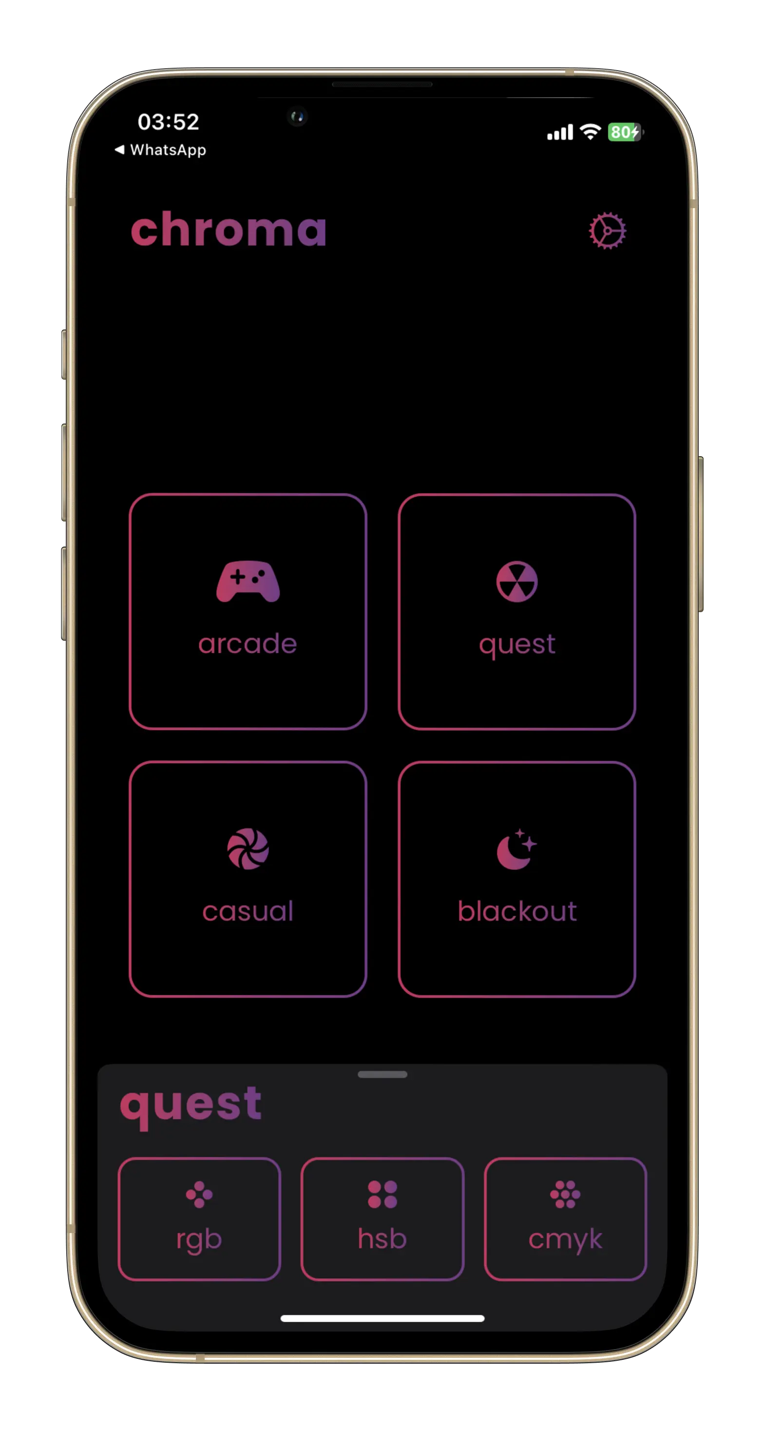
The example code shows how my app, Chroma Game, will use the new .presentationBackgroundInteraction(_:) modifier. It enables interaction with the view behind a sheet when it is at the smallest fractional detent but not when they are medium or large:
.sheet(item: $viewModel.activeSheet) { sheet in
  HomeColorModelSheet(activeSheet: sheet)
    .presentationDetents([.fraction(0.2), .medium, .large])
    .presentationBackgroundInteraction(.enabled(upThrough: .fraction(0.2)))
}
You can see that the background view is still not dimmed:

This new modifier can be useful for creating a more immersive and interactive experience in your SwiftUI app. By allowing users to interact with the content behind a sheet, you can make a more seamless transition between views and provide a more natural flow for your app.
Translucent and Custom Background
As of now, you cannot control the background of the sheet, like making it translucent, and it can only be opaque. With the new modifier, you can customize the background appearance of a sheet, making it more visually appealing and consistent with your app’s overall design.
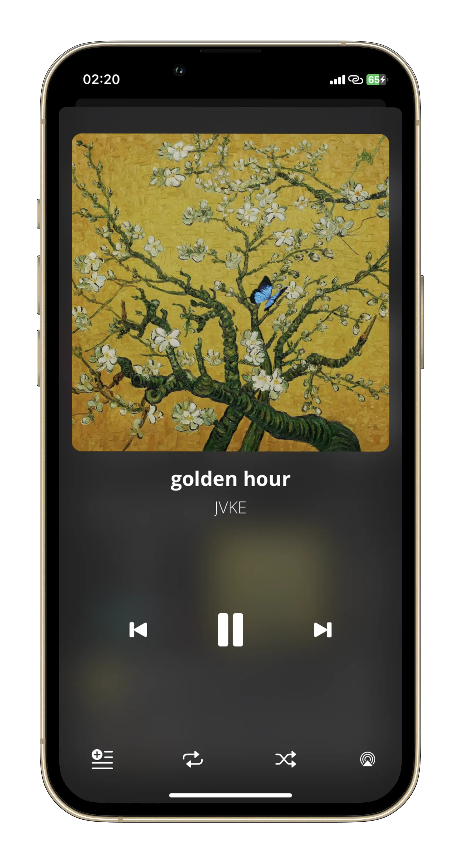
The example shows how my app, Euphonic, will use the background of thinMaterial when showing the now-playing view:
EuphonicTabView()
  .sheet(isPresented: $nowPlayingViewModel.showMusicPlayer) {
    NowPlayingView()
      .presentationBackground(.ultraThinMaterial)
  }
Running the app on the phone:

You can even provide a custom view as the background:
EuphonicTabView()
  .sheet(isPresented: $nowPlayingViewModel.showMusicPlayer) {
    NowPlayingView()
      .presentationBackground {
        LinearGradient(colors: [.red, .pink, .purple], startPoint: .topLeading, endPoint: .bottomTrailing)
      }
  }
By using the .presentationBackground(_:) modifier, you can enhance the visual appeal of your app with the translucent background effect and create a sense of depth and dimension, making your app look and feel more modern and polished.
Corner Radius
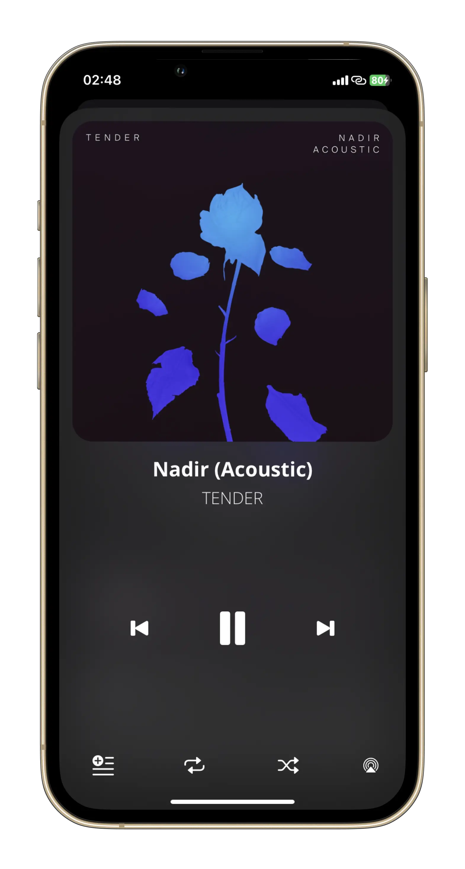
Another modifier that we all expected in the first iteration itself is the presentationCornerRadius(_:) modifier, which allows you to set the corner radius of your presentation to a specific value:
EuphonicTabView()
  .sheet(isPresented: $nowPlayingViewModel.showMusicPlayer) {
    NowPlayingView()
      .presentationCornerRadius(36)
      .presentationBackground(.thinMaterial)
  }
This is how it looks:

Conclusion
The new modifiers are great to work with, but it sucks that they are only 16.4+. Apple being Apple, I guess. Tag @rudrankriyam on Twitter with your thoughts.
Thanks for reading, and I hope you’ll enjoy using the new sheet modifiers few months/years down the line!
Exploring MusicKit and Apple Music API
Unlock the full power of MusicKit & Apple Music APIs in your apps with the best guide! Use code musickit-blog for a limited-time 35% discount!


